Orphan Pages & SEO: What Are Orphan Pages & How Do I Find Them?
Enterprise SEO
Indexing
Mobile
Page Depth
Sitemaps
Technical SEO


Everyone agrees that website navigation is important but different teams can have very different views on what is crucial for “good” website navigation. Below we will discuss the different types of navigations, the considerations from different teams and we’ll end with some pro-tips to help you create not only user-friendly but also SEO-friendly navigation. But first and foremost;
Your website navigation is one of the primary ways that search engine crawlers find and crawl your content. Well-structured navigation can help search engines understand which pages are most important and can help shape page authority. Conversely, incomplete or overly crowded website navigation can make it harder for crawlers to find important pages, or dilute link equity. In the below examples we will look at three different website structures and their impact on internal linking.
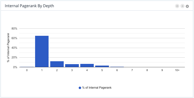
Website A ✔
This is a large e-commerce website with well-organized website navigation, where the important pages sit 1 or 2 clicks away from the homepage and most of the internal ‘link juice’ is supporting these strategic sections.
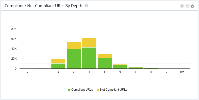
Note: compliant URLs = indexable URLs
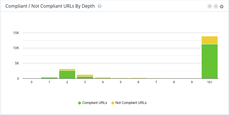
Website B ✘
This is a classifieds site, where the site structure is deep and due to less optimal navigation, it takes more clicks for search engines (and users!) to find the important pages. This shows in the diluted internal Pagerank as well.
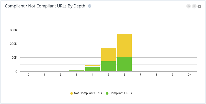
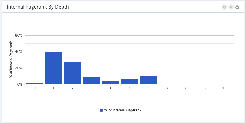
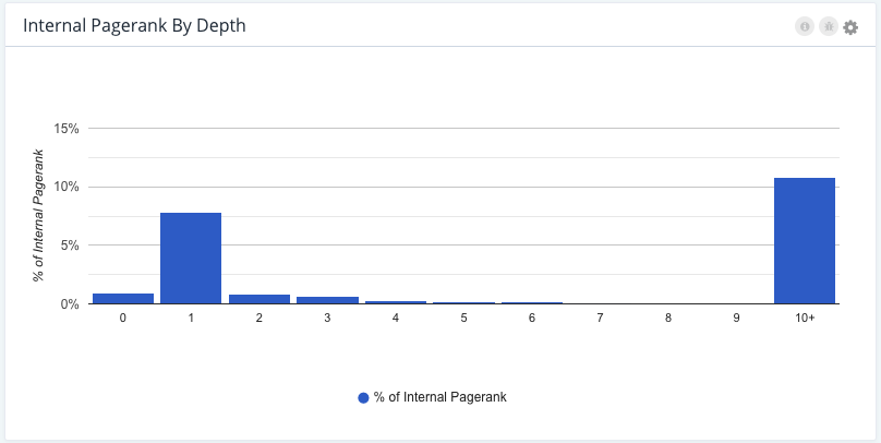
Website C ✘
This is another example of a classified site, where bots get trapped due to the number of filters in the faceted navigation. The site structure is deep and the number of URLs grows as the site crawl goes deeper. This suggests that there are potential crawl traps for search engine bots and it results in internal Pagerank being trapped below depth level 10.
When understanding your site structure, pay attention to your strategic compliant (indexable) pages and make sure these are only a few clicks away from the home page. Pay attention to the internal linking from the different types of navigations on your site, and make sure that strategic pages are always easy to access. But before we move on to how to create this, it’s important to understand the different considerations of the different teams.
User experience (UX) design and Product priorities are additional elements in building website navigation. UX design is about making the website easy to use for users (this can also include web accessibility standards for making websites accessible for users with disabilities). The product wants to focus on highlighting the key Services, Products, Solutions the website offers and navigating the users to convert, while SEO’s focus on a combination of these, including website crawlability.
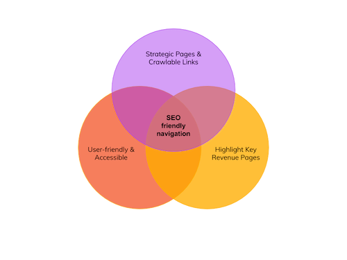
UX design recommendations often align well with SEO considerations, since a good user experience is important for SEO, and requirements from Product to link to pages that are key for revenue generation will usually overlap with strategic pages for SEO. Optimal website navigation should include all of these requirements and place links to all of the relevant pages from the best-suited navigation of the website.
The phrase website navigation refers to a set of links allowing the user to easily move between pages on a website. There are many different types of website navigation, including universal navigation, mobile navigation, ‘hamburger’ menu, sidebar, filtering, footer menus, and sitemaps. Technically speaking, even the use of individual internal links within body copy and elsewhere on the site could be considered an element of ‘website navigation’ — since these are links that enable a user to navigate the website — but typically this is referred to as internal linking rather than website navigation.
The most common example of website navigation is the universal navigation bar (also known as a ‘top nav’, ‘main nav’ or ‘menu’) that typically sits at the top of a website and is present on most, if not all, the pages of the site. When it comes to optimizing the main navigation, it’s important to include your key strategic pages for SEO. A common challenge SEOs face when it comes to the top nav is that they need to find an agreement with both UX and Product on how this navigation is built.
While SEOs might want to include all the links to the key strategic pages, UX might challenge the idea of navigation overloaded with too many options as it can confuse users. Make sure to collaborate with your user experience teams to agree to the optimal number of links from this menu so you can prioritize your list of SEO pages based on that and utilize some of the other navigation types and internal linking opportunities for other pages.
The next team you would usually need to find an agreement with is the Product team. For eCommerce, Classified, Publisher, or lead generation sites, the main navigation is key for the Product team to include the relevant call to action: such as a call for Black Friday offers, an action to request a quote or ever-changing navigation with fresh articles and news. Make sure to work with the Product team to decide on which strategic pages are crucial to always be part of the navigation.

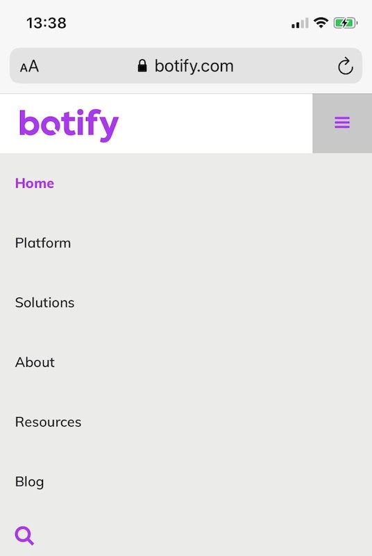
As we are in the age of the mobile-first approach, we must talk about universal navigation on the mobile version of a website. This will typically look different than it does on desktops to provide a mobile-friendly user experience. This is most commonly a visual difference, i.e. the use of a 3 bar icon that opens links in a drop-down, known as a ‘hamburger’ menu. Make sure this menu includes the same links as the desktop version and that the navigation experience is still the same as the desktop version. This is recommended not only to avoid confusing users who would browse on your site across multiple devices but also make sure that search engines are crawling the same versions. This is crucial when it comes to mobile-first indexing.

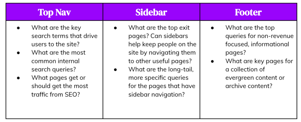
A sidebar menu is typically used to allow easier navigation within a section of a website while maintaining the universal navigation menu at the top of the page. This can be a really useful navigation for SEOs as it provides plenty of opportunities to the internal link between relevant pages.
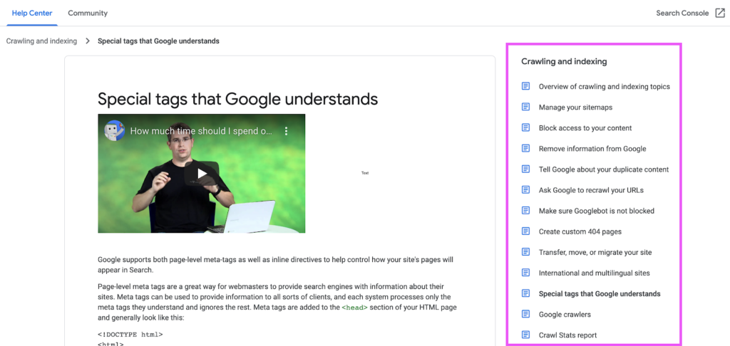
example of sidebar navigation via support.google.com
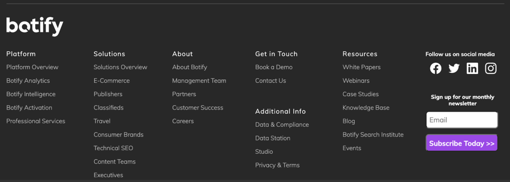
A footer menu is typically used as a secondary universal navigation, allowing the website to link to business-related pages which are important to make accessible but are less frequently visited by a typical user (i.e. ‘about us’, careers, privacy policy, terms and conditions, corporate locations, social media profiles, etc). However, this does not mean that this section should be used as SEO navigation, as it can easily get overloaded and look spammy that way. Make sure to keep this user-friendly and complimentary to the top navigation you have on the site. If your top navigation is frequently changing, this could be a good place to have a more consistent navigation and link to certain archives and evergreen content such as ‘resources’. This is also the menu where certain websites link to their HTML sitemaps if they have one.
Sitemap (XML & HTML)
When it comes to sitemaps there are two types we need to talk about. The sitemap.xml, which is crucial for SEO, is an XML file, usually sitting under your main domain on a URL such as https://www.botify.com/sitemap_index.xml. This is crucial for search engines, and usually fully managed by SEO teams. You can find out more about how to audit your XML Sitemaps on our blog. Meanwhile, an HTML sitemap is an HTML page with a list of links to all the pages on the website. This is more commonly seen on smaller sites and works as a directory to all of the pages.
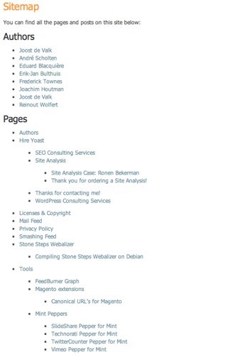
example of HTML Sitemap via Yoast.com
This type of navigation allows for users to add ‘facets’, or filters, from a menu to sort or filter the contents of the page. This is most commonly seen on large eCommerce, Publisher and Classified websites such as Marketplaces or Job boards.
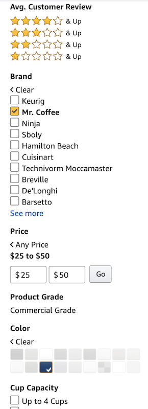
example of faceted navigation on Amazon.com
Faceted navigation itself has its unique challenges when it comes to crawlability, indexation, and user experience and you can read more about this specifically: how it impacts SEO and common considerations on our blog.
It’s also important not to confuse site structure created by all internal links and website navigation with site structure based on information architecture.
A common misunderstanding about web navigation design is that it is the same as information architecture (IA). Information architecture is related to web navigation, and a strong IA will inform the design of web navigation, but the two should not be conflated (especially for SEO purposes).
The goal of information architecture is to identify and define site content and functionality and describe the structure, organization, and naming conventions for how the content and/or functionality relates to itself. Web navigation is about making sure the user can most easily access the most important pages, which do not always fall into the same categorization as the overall IA of the website.
For example, you could have a recipe website which is structured as follows:
All Recipes > {Meal} Recipes > {Core Ingredient} Recipes > Individual Recipe
So for example:
All Recipes > Dinner Recipes > Chicken Recipes > Chicken Marsala
And your URLs would typically reflect that structure, e.g.:
www.recipes.com/all-recipes/dinner-recipes/chicken-recipes/chicken-marsala
The information architecture would structure these four elements as four levels of the site, with Chicken Recipes at level three (next to Fish Recipes and Pork Recipes and Vegetarian Recipes). But if your chicken recipes are the most popular from an SEO perspective, followed by dinner recipes, your top nav might look like this:
Home | Chicken Recipes | Dinner Recipes | 15 Minute Meal Recipes | Contact Us
This does not change the information architecture of your website – the chicken dinner recipes are still in the /dinner-recipes subfolder – but makes it easier for users who want quick access to chicken recipes to find what they’re looking for as quickly as possible.
By linking to this very valuable category page directly from the universal navigation, you also send a signal to crawlers that this is an important page and should be given more weight from a page authority perspective than other pages at the same ‘level’ of the site structure, such as the less popular tilapia recipes.
Now that we understand the requirements that go into designing an optimal website navigation, it’s time to review some pro-tips on how SEO can prepare their requirements the best way to create a not only user and product but also SEO-friendly navigation
Before you do anything you must talk to the relevant stakeholders in the business to understand their requirements and see what flexibility you have when it comes to changing the site navigation. Don’t forget that this is a process and if your argument is valid you can always build a use case to prioritize SEO. Keep in mind that SEO-friendly navigation is in everyone’s interest.

Once you understand the requirements, create a list of the key SEO considerations for each navigation type.
3. Create your Page types
Segment your site based on queries, traffic, revenue, and content type. I.e. have a look at the highest traffic driving queries and the pages they drive traffic to. Then consider the direct or indirect revenue these generate and create your page types.
Strategic pages (i.e. key Category & Product pages)
Opportunity pages (i.e. underperforming Category & Product pages)
Important non-revenue pages (i.e. Informational pages for delivery, refunds, etc.)
Tailored pages (i.e. Blog pages directly related to a specific Product or Category)
4. Monitor, Audit, Review, Implement
As always when it comes to site changes and SEO, it’s also important to monitor and audit your navigation and its impact on Crawlability and Internal PageRank. Review your page types and queries regularly and follow the four-step process to update accordingly.

Sign up for our monthly newsletter.


